Is the world that we see the world that truly exist?
This question has engaged many thinkers and intellectuals for centuries. It has also led to the production of one of the greatest franchises of Cinema; namely, Matrix. However, many decades before the Wachowski sisters even thought of it, Kant had already focused half of his life-long research on this paramount doubt. But how is all this related to the title of this article?
Well, we must take another step backwards and set our attention on the Gestalt psychology, a school of thought born in Germany at the beginning of the XX century. According to Gestalt thought, what we perceive is more than what actually exist around us, because “the whole is more than the sum of its parts”. The reason of it is that human perception is not just about seeing what is present in the world around us. It is also heavily influenced by our motivations and expectations. Gestalt psychology then kept developing in the US and affected the theories of visual communication.
So, if you are wondering how your mind works on reality and how you can crack the system, here are some of the principles that Gestalt school has discovered:
1) Law of Prägnanz: all of the principles speak to the Law of Prägnanz (which is also known as the Law of Good Gestalt). Prägnanz is a German word which can be translated to “pithiness”, or “orderliness.” This law suggests that the mind looks for orderliness or simplicity when looking at images. This is what allows us to create meaning in a complex and chaotic world. It is more simple to see one whole image rather than the sum of its parts. That is why, when we look at an image of a book, we don’t see a cover, back cover, and over 100 individual pages, but we see just one whole item.
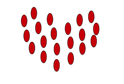
2) Proximity: objects near each other tend to be viewed as a group.
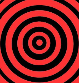
3) Similarity: we naturally group similar items together based on elements like color, size, and orientation.
4) Common region: we tend to group objects together if they are located in the same bounded area.
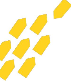
5) Common fate: people tend to group objects which seem to be moving or pointing in the same direction. These groups are made up of individual elements, but they move as a whole.

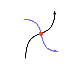
6) Continuity: we perceive elements arranged on a line or curve as related to each other, while elements that are not on the line or curve are seen as separate.

7) Closure: The principle of closure states that when we look at a complex arrangement of visual elements, we tend to look for a single, recognizable pattern. In other words, when you see an image that has missing parts, your brain will fill in the blanks and make a complete image so you can still recognize the pattern.

8) Past experience: people tend to recognize objects based on their experience. So, for example, you likely interpret the red, yellow and green circles as a traffic light, because that is where we often see these colors and shapes.

9) Figure-Ground: people instinctively perceive objects as either being in the foreground or the background. They either stand out prominently in the front (the figure) or recede into the back (the ground).

These principles have served as guidelines for designers, marketers, and anyone who wants to build a satisfying image.
Another fundamental element, or rather, the prime factor of visual communication is color. Colors simplify the perception of reality, because they let us identify figures in the space. They can also modify space perception: just think of how shades change the appearance of objects.
A Swiss painter and designer named Johannes Itten invented a useful diagram to classify colours.
The Itten Circle summarise in an easy and effective way the colour system and guide us to a more conscious use of them. Due to his invention, Itten is considered the father of colour classification.
But how to read this diagram?
Based on their aesthetic and communicative aspect, Itten divided colors into: primary, secondary and tertiary.
In the center of the circle there is a triangle which contains the three primary colours: red, yellow and blue. Around this triangle, an hexagon is formed with the secondary colours obtained by mixing the primary ones. The secondary colours are placed in correspondence of the primary colours used to form each of them. Lastly, a circle of 12 segments encloses the two, showing all the colours ordered by their components.
The combination of colours found in the same segment of the chromatic disk generates a harmonious and balanced effect.
Vice versa, the combination of colours that are located on the opposite side of the chromatic disk (called complementary colours) determines a lively effect, because the complementary colours light up and enhance each other.
Itten suggested that complementary colours represented the best colour combinations.
Further tips suggested by the Itten Circle could be:
It is advisable not to wear clothing that has similar colours, even if of different shades;
It is appropriate to choose the combination of similar patterns that present contrasting colours;
According to Itten, a colour that can be combined with everything is black. It can be combined with both bright and soft hues, except for brown and blue;
The other colour that, according to Itten, can be combined with everything is white, defined as the only colour able to look good with any colour, with every shade from pastel to bold ones.

Both the Gestalt principles and Itten’s theories has been applied by the art world since the beginning of the XX century. We must mention in particular the movement of Pointillisme. As suggested by the name, Pointillisme technique consisted in drawing an incredible amount of close-range points in order to create an image without tracing continuous outlines. Moreover, in addition to Itten’s theories, Eugen Chevreul, one of the theorist of Pointillisme, conceived his own theory about complementary colours, stating that every coloured point is surrounded by a halo of its opposite colour. Therefore, if put alongside, two opposite (or complementary) colours have the power to increase each other.
If seen from a distance, a Pointillisme picture seemed to be a whole image with perfectly recognizable elements and figures. This is possible due to the principles of visual effects studied by Itten and the Gestalt.
Let’s prove these theories by making your little Pointillisme-styled picture!
SOURCES: https://www.usertesting.com/resources/topics/gestalt-principles
https://www.verywellmind.com/what-is-gestalt-psychology-2795808
https://www.cromalab.info/le-leggi-della-gestalt-sulla-percezione-visiva-che-utilizziamo-inconsapevolmente/
https://practicalpie.com/gestalt-principles/
https://www.dandygentleman.com/itten-circle/
